
User research
Before designing, we establish who uses the thing and what they are trying to finish. Stakeholder conversations, a review of your existing analytics and support questions, and a walkthrough of the current experience where one exists.
Interface design that is planned before it is decorated. Structure, flow and hierarchy first — so the finished screens are attractive because they are clear, not instead of being clear.

Products whose users get stuck or drop out partway through
Businesses about to build and wanting the structure right first
Teams with inconsistent screens built by different people over time
Founders who need a design a developer can build without guessing
Each part below is delivered as standard within the agreed scope — none of it is a premium upgrade.
Before designing, we establish who uses the thing and what they are trying to finish. Stakeholder conversations, a review of your existing analytics and support questions, and a walkthrough of the current experience where one exists.
What lives where, and what it is called. Navigation, page hierarchy and naming decided deliberately — this is the layer that decides whether people can find things, and it is also what search engines read.
Low-fidelity layouts that settle structure and priority before colour and typography enter the conversation. Cheap to change, and they surface disagreements early while they are still inexpensive.
Full visual design in Figma: typography, colour, spacing, components and states, applied consistently across every screen in scope.
Screens designed at mobile, tablet and desktop widths — including what collapses, what stacks and what is hidden — so responsive behaviour is a decision rather than an accident of implementation.
Clickable prototypes that let you walk the real flow before it is built, which is the cheapest possible moment to discover that a step is in the wrong place.
Reusable components, type scale, spacing scale, colour tokens and interaction states, documented so future screens stay consistent with the ones already shipped.
Organised files, named layers, defined spacing and states, exported assets and annotated behaviour — everything a developer needs to build it accurately without a follow-up call for every measurement.
Four stages, each with a clear output, so you always know what is happening and what comes next.
Goals, users, constraints and the current experience.
Information architecture and wireframes, reviewed before visual design begins.
High-fidelity screens and components across every breakpoint in scope.
Clickable flow, then a build-ready file and design system.
Tooling is chosen per project rather than by habit. If something simpler will do the job and leave you easier to support later, that is what gets used.
Real, shipped projects — with what was built, and nothing invented about the results.
A pixel-perfect Figma-to-code implementation matching client brand guidelines, followed by full website development.
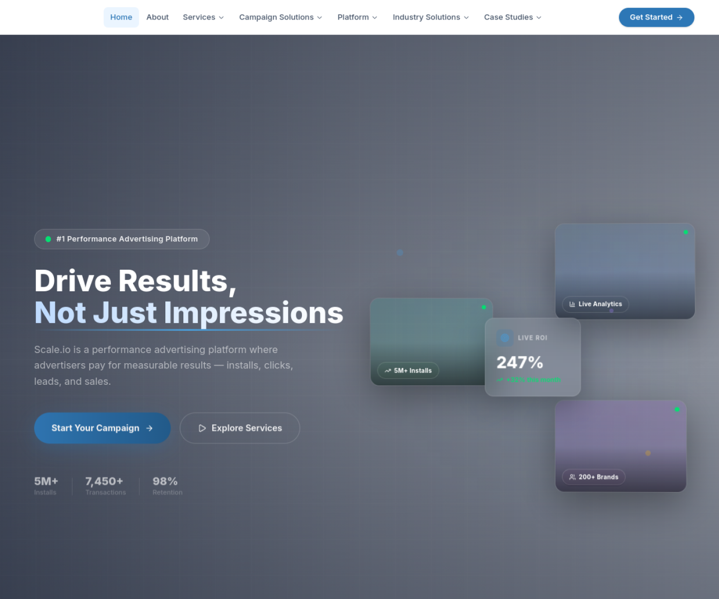
A full website for a performance marketing agency, designed and developed from scratch.
Yes. Design can be delivered as a standalone project with a handoff package your own developers build from.
More answers on the full FAQ page.
Tell us what you need and you will get a straight answer on scope, approach and cost — with no obligation.